Fact-checked by the SnapMessages editorial team
The Verdict
Gesture navigation is usually the better choice if you spend more than 2 hours a day on your phone and have built clean swipe habits over at least a week. It is not the right call if you have motor impairments, arthritis, De Quervain’s tenosynovitis, or are still in the adaptation window, in those cases, physical buttons are both safer and more accessible.
The debate over phone gestures vs buttons gets framed as a preference question, swipe gestures look cleaner, buttons feel familiar, pick your side. But the factor that actually swings the decision is biomechanical: how much cumulative load each input method places on your thumb tendons and wrist joints across the roughly five hours per day the average American spends on their phone. That is where real clinical consequences live.
This matters now because phone screens have grown to an average of 6.5 inches as of 2023, meaning the ergonomic math calculated when Google redesigned Android navigation in 2018 no longer applies to the hardware most people are actually holding. The navigation debate has moved on; most of the articles about it have not.
| Factor | Reasons to Use Gesture Navigation | Reasons to Stick With Physical Buttons |
|---|---|---|
| Thumb load | Fluid swipe arcs distribute force across a larger joint range, reducing peak pressure on the metacarpophalangeal joint | Discrete taps are brief, low-force actions requiring no sustained muscle hold |
| Static muscle fatigue | Simple upward home swipe is low-load and quick | No mid-air hold required; avoids the 2–4 second static hold needed to open the app switcher with gestures |
| Screen real estate | Eliminates the persistent navigation bar, recovering roughly 8–10% of vertical screen space | On today’s 6.5-inch screens, the bar consumes proportionally less space than it did on older 5.5-inch flagships |
| Accessibility | Works well for users with full dexterity who have completed the learning curve | Clearly labeled buttons are reliably activatable for users with motor disabilities, tremors, or limited dexterity |
| Learning curve injury risk | Minimal once habitual; fluid gestures align with the natural thumb arc | Zero adaptation window; buttons are immediately usable without tense overcorrecting movements |
| One-handed use on large phones | Edge-swipe back gesture can be triggered closer to the hand’s natural grip position | Bottom-center buttons on a 6.7-inch device require an uncomfortable thumb stretch for most hand sizes |
| Older adults and hand conditions | Appropriate only after confirmed dexterity and pain-free status | Safer for users with arthritis, carpal tunnel, or De Quervain’s tenosynovitis; precision-gesture edges can trigger pain flare-ups |
Key Takeaways
- Gesture navigation is likely the right move if you have been using swipe navigation for at least 7 days and no longer consciously think about the motions.
- Stick with buttons if you have any diagnosed hand condition, arthritis, carpal tunnel, or De Quervain’s, where precision gesture edges increase flare-up risk.
- If your phone screen is 6.5 inches or larger, neither bottom-edge buttons nor edge-swipe gestures sit in the thumb’s natural comfort arc; consider phone size and grip posture first.
- The app-switcher gesture (swipe up and hold for 2–4 seconds) creates more static muscle fatigue than a discrete button tap, avoid it regardless of which navigation style you prefer.
- If you spend fewer than 2 hours per day on your phone, the ergonomic difference between gestures and buttons is negligible; choose whichever you find less distracting.
- Users with motor disabilities, tremors, or cognitive impairments should default to buttons: path-based gestures fail accessibility standards for this group, and labeled buttons remain reliably activatable.
- If you are still in the first 3–7 days of switching to gestures, expect elevated short-term strain from tense, overcorrecting swipes; give the adaptation period time before judging the ergonomic outcome.
Your Navigation Choice Is Actually a Health Decision
Most people treat this as a cosmetic call. It is not. Repetitive smartphone use is clinically linked to De Quervain’s tenosynovitis, carpal tunnel syndrome, and what hand surgeons informally call “texting thumb”, and the specific micro-movements your navigation method demands repeat thousands of times a day. A cross-sectional study found that more than 52% of heavy smartphone-using college students showed signs of De Quervain’s tenosynovitis, which tells you this is not a fringe concern.
The phone gestures vs buttons question, properly understood, is about which input pattern accumulates less joint stress over months of daily use. That framing is almost entirely absent from mainstream tech coverage, which focuses on screen real estate and aesthetic cleanliness rather than what happens to your thumb tendons across a year of the same motion repeated five hours a day.
The stakes are real. But the answer is not universal, and the rest of this article is about finding which side of the line you are on.
What Actually Happens to Your Thumb When You Tap vs. Swipe
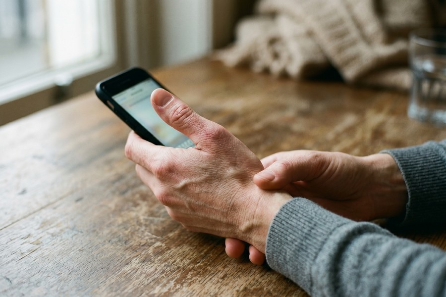
Discrete button tapping concentrates repetitive force on the metacarpophalangeal joint and engages the adductor pollicis and flexor pollicis brevis tendons in a short, high-impact contraction. Swipe gestures distribute that load across a larger arc of motion, reducing peak pressure at any single joint. That is the biomechanical case for gestures, and it is a real one, but it comes with a condition most pro-gesture articles skip.
The static “swipe-up-and-hold” pattern required to open the app switcher on gesture-based systems demands a 2–4 second mid-air thumb hold. Static muscle contractions are biomechanically more fatiguing than brief dynamic taps because they sustain tension without the momentary release that lets blood flow back into the muscle. In practice, users who open the app switcher dozens of times a day may be creating more cumulative fatigue with gestures than with buttons, even though the simple home swipe is genuinely lower-load.
Not all gestures are equal, and that distinction matters. A straightforward upward home swipe is low-demand. A pinch-to-zoom or a diagonal multi-finger app-switch recruits the same high-strain muscle groups as aggressive repetitive tapping. Calling all gesture navigation “ergonomic” as a blanket claim is misleading; the biomechanical cost depends entirely on which gesture you are performing and how often.
The Learning Curve Creates Its Own Injury Risk
Switching to gesture navigation carries a short-term physical cost that almost no review mentions: during the 3–7 day adaptation window, users make tense, overcorrecting swipe attempts that increase strain acutely. The ergonomic benefit of fluid gesture use is real, but it is conditional on the user building clean motor habits. Rushed adaptation works against you.
Nielsen Norman Group’s mobile UX research found that replacing the iPhone’s physical Home button with swipe gestures (as Apple did with the iPhone X) resulted in more effective screen use but introduced initial learning hurdles for users accustomed to the physical button. NN/G’s finding was framed as a usability issue, but the physical dimension compounds it: learning hurdles mean tense, deliberate movements rather than the relaxed, habitual ones that make gestures ergonomically viable.
If you are currently in that adaptation window and your thumb or wrist feels more strained than usual, that is expected, it is not proof that gestures are wrong for you. Give it the full week before deciding. If soreness persists past day 10, revert to buttons and address your overall usage habits first. If you are already building automation workflows to reduce repetitive phone interactions, the guide on automating repetitive tasks on iPhone using Shortcuts is worth reading alongside this one.
Screen Size Has Changed the Equation
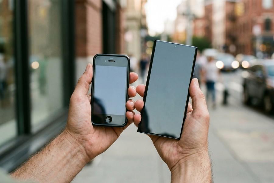
The gesture navigation system was designed when flagship phones had screens around 5.5 inches. Today’s average has reached 6.5 inches, according to Consumer Technology Association data cited by Verified Market Research, a full inch larger in just five years. That shift changes thumb reach geometry in ways the original ergonomic argument never accounted for.
On a 6.7-inch device like a current Samsung Galaxy S25 Ultra or iPhone 15 Pro Max, the bottom-center button placement requires a significant thumb stretch for most hand sizes. But edge-swipe back gestures are not automatically better: depending on grip position, the left or right edge may sit equally far from the thumb’s resting arc. The honest conclusion is that on large phones, neither navigation system occupies the natural comfort zone without intentional grip adjustment.
That means the real ergonomic fix for large-phone users may be phone size and grip posture rather than navigation style. A phone held with two hands, or propped on a stand at eye level, removes the compounding effect of awkward wrist angle and static gripping load that no navigation setting can solve on its own. If you want to understand how your phone’s hardware features interact with usage habits, the breakdown of hidden Android developer options worth enabling covers some useful display and input settings that pair well with either navigation style.
The Accessibility Case for Buttons Is Stronger Than You Think
For users with motor disabilities, tremors, limited dexterity, or cognitive impairments, physical buttons are not just a preference, they are the more medically sound choice, and this is largely ignored in mainstream phone gestures vs buttons coverage.
The W3C’s Mobile Accessibility guidance specifies that touch targets must be at least 9 mm high by 9 mm wide and that all functionality operable by gestures must also remain operable through assistive technologies. And WCAG Success Criterion 2.5.1 requires that any functionality using multipoint or path-based gestures must also be operable with a single pointer, precisely because gesture-only interfaces exclude users with motor impairments. These are not design guidelines; they are accessibility floor standards.
A peer-reviewed study indexed by the National Library of Medicine (NIH) found that as touchscreens replace physical buttons, older adults face compounding challenges from declining vision and reduced physical responsiveness, underscoring the importance of button size and placement in touchscreen interface design. For someone managing arthritis, De Quervain’s, or early-stage carpal tunnel, precision-edge gestures can trigger flare-ups that a well-placed tap target would not. In those populations, buttons are not old-fashioned, they are the right clinical call.
The cognitive load dimension is underreported as well. Clearly labeled navigation buttons with consistent, predictable positions reduce navigation errors for users with cognitive disabilities or dementia. Gesture systems require users to remember invisible inputs with no visual anchor. For health-oriented users concerned about cognitive accessibility for themselves or family members, this is the angle that settles the debate.
Who Should and Who Should Not
Good candidates for gesture navigation
Gesture navigation pays off most for users who have already passed the learning curve and maintain healthy hand habits.
- Healthy adults who use their phone more than 2 hours daily and have completed at least 7 days of gesture adaptation without persistent soreness
- Users on phones with screens 6.0 inches or smaller, where edge-swipe gestures land closer to the thumb’s natural resting position
- People who rarely use the app-switcher gesture and can avoid the static 2–4 second hold that causes disproportionate muscle fatigue
- Users who already take micro-breaks, alternate fingers, and hold their phone propped rather than gripped statically for long sessions
Who should skip it
Buttons are the safer and more reliable choice for a specific set of users, regardless of what the tech press recommends.
- Anyone with a diagnosed hand condition (arthritis, De Quervain’s tenosynovitis, carpal tunnel syndrome) where precision-edge gestures increase flare-up risk
- Older adults experiencing declining grip strength or fine motor control, for whom discrete labeled buttons are more reliably activatable
- Users with motor disabilities or tremors: path-based gestures fail WCAG 2.5.1 accessibility standards for this group
- People currently in the 3–7 day gesture adaptation window who are experiencing elevated thumb or wrist soreness
- Users with cognitive disabilities or dementia who benefit from the consistent visual anchors that labeled buttons provide
Practical Adjustments That Matter More Than Switching
Here is the honest caveat: no navigation style prevents repetitive strain injury on its own. Total daily usage time, grip posture, and whether you take micro-breaks are larger variables than gestures vs. buttons as a standalone factor. A user spending 5+ hours a day on their phone with poor wrist angle will develop strain problems regardless of how they navigate.
The concrete fixes that apply regardless of navigation choice: alternate between your thumb and index finger for tapping rather than defaulting to the thumb for every interaction. Prop your phone at eye level using a stand to eliminate the wrist flexion and “tech neck” that compound hand strain. Enable voice-to-text for heavy typing sessions to offload repetitive tapping entirely. And take a deliberate 2-minute break every 30 minutes of continuous phone use, the same logic behind structured focus techniques covered in our review of the best Pomodoro timer apps for deep focus.
Grip posture also determines ulnar nerve pressure and wrist angle in ways that navigation mode cannot override. How you hold the phone, not just what you tap, is the variable most people underestimate. If your phone is consistently held in a static one-handed grip for long sessions, the gesture-vs-button question is secondary to fixing that habit first.
It is also worth connecting this to broader digital hygiene. The personal digital security routine guide on this site covers screen-time and usage structure habits that reduce both security risk and physical overuse, the two concerns overlap more than most people realize.
An interesting secondary data point: the consumer electronics segment dominated the gesture recognition market in 2024, accounting for a revenue share of 56.7% according to Grand View Research’s 2025 industry analysis, driven by low technical complexity for end users. The market is clearly moving toward gestures. But market momentum is not the same as the right choice for any individual user.
And despite that market direction, an Android Central reader poll found that 81% of respondents said they prefer 3-button navigation over gesture navigation on their Android smartphone. User preference and industry direction are pulling in opposite directions, which is exactly why the answer here is conditional rather than categorical. Understanding how your phone’s underlying system handles input also connects to how apps process information in the background; the explainer on how push notifications work behind the scenes is a useful companion read for anyone thinking systematically about phone interaction design.
Frequently Asked Questions
Is gesture navigation better for your hands than physical buttons?
It depends on which gestures and how you use them. Simple swipe gestures distribute thumb load more broadly than discrete tapping, which is genuinely lower-stress on the metacarpophalangeal joint. However, the app-switcher hold gesture (2–4 seconds static) creates more muscle fatigue than a button tap, so the answer is not a blanket yes for all gesture types.
Should I switch from 3-button to gesture navigation on Android?
Switch if you are healthy, use your phone heavily, and can commit to the full 7-day adaptation window without rushing. Do not switch if you have any hand condition, motor impairment, or are already experiencing wrist or thumb soreness. An Android Central poll found 81% of users still prefer 3-button navigation, which reflects how high the friction of switching actually is in practice.
Can phone gestures cause repetitive strain injury?
Yes, though the risk profile differs from button tapping. Gesture overuse can inflame extensor tendons and the volar plate ligament, particularly through pinch-to-zoom and multi-finger swipes that recruit high-strain muscle groups. No navigation style is fully safe at 5+ hours of daily use; total usage time and grip posture matter more than navigation mode alone.
Are phone buttons or gestures better for older adults?
Buttons are generally better for older adults. Research indexed by the National Library of Medicine found that older adults face compounding challenges as touchscreens replace physical buttons, due to declining vision and physical responsiveness. Clearly labeled, stable button targets are more reliably activatable than precision-edge gesture inputs for this group.
Do phone gestures meet accessibility standards?
Not fully, for all users. WCAG 2.5.1 requires that any path-based or multipoint gesture must also be operable with a single pointer, because gesture-only interfaces exclude users with motor impairments. The W3C’s Mobile Accessibility guidelines further specify that focus moved via swipe gestures must have a return method compatible with assistive technology, a requirement that many gesture implementations fail.
Does phone screen size affect whether I should use gestures or buttons?
Yes, and this is underreported. The average smartphone screen reached 6.5 inches in 2023, up from 5.5 inches in 2018, and at that size, neither bottom-edge buttons nor edge-swipe gestures naturally fall within the thumb’s comfortable reach zone for most hand sizes. On large phones, grip posture and phone size are more important ergonomic variables than navigation style.
Sources
- Nielsen Norman Group, State of Mobile UX 2018: Gesture Navigation and Learning Curve
- W3C / Web Accessibility Initiative, Mobile Accessibility: How WCAG 2.0 and Other W3C/WAI Guidelines Apply to Mobile
- WCAG 2.5.1, Pointer Gestures (Level A) Accessibility Criterion
- National Library of Medicine (NIH/PubMed), Touchscreen Button Position and Usability for Older Adults
- Android Central, Poll Results: Android Users Pick Between Gestures and 3-Button Navigation
- Grand View Research, Gesture Recognition Market Size, Share and Trends Report (2025)
- Verified Market Research, Smartphone Display Market Size, Forecast and Analysis